As I tweeted earlier today, it seems that many websites are putting their advertisers in front of their users.
Literally.
I’ve started screenshotting these offenses, and then running them through Skitch and highlighting the important stuff.
Today’s winner:
Macworld
Macworld on the iPad is horrendous. I like the content, being the Apple nerd that I am. But going to the actual site is a nightmare. Here’s the screenshot:
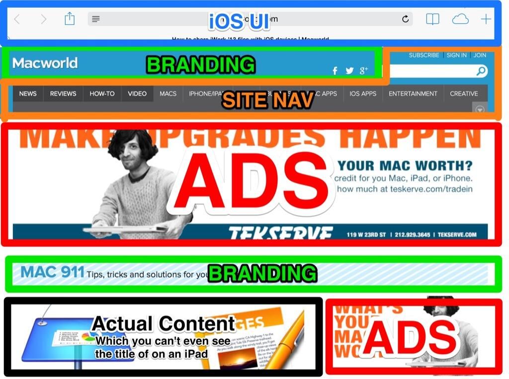 Macworld Screenshot
Let’s go over this together.
- The blue box, you can’t get rid of. That’s just part of the iPad UI.
- The top green box is the site header, that’s acceptable.
- The orange box is the nav bar. Again, necessary and appropriately sized for the screen.
- The Big Red Box is an ad for Tekserve. It’s a great store here in New York and I go there often. But the ad is bigger than the iPad UI, the site branding, and the site navigation COMBINED.
- The next green box is more branding. In this case, it’s a banner with the title of the series, Mac 911. This may be necessary, but instead of a generic tagline, the title of the article would be helpful here, especially given the screen size.
- Next, another Big Red Box with another ad for TekServe. In case you missed the ENTIRE MIDDLE THIRD OF THE SCREEN.
- Finally, in a small box in the lower left, you can see the top half of the graphic introducing the article about iWork. I assume it’s about iWork, because I recognize the icons in the picture. But, nowhere on the page (“above the fold” for you newspaper lovers out there), is any indication of the subject.
I get that websites have to advertise to make money. I also get that no one will read your website if they can’t actually see the content. I’d like to see the click-through numbers on the giant banner ad vs. the tasteful sidebar ad.
🗓️ May 5, 2014
 |||
|||