 |||
|||
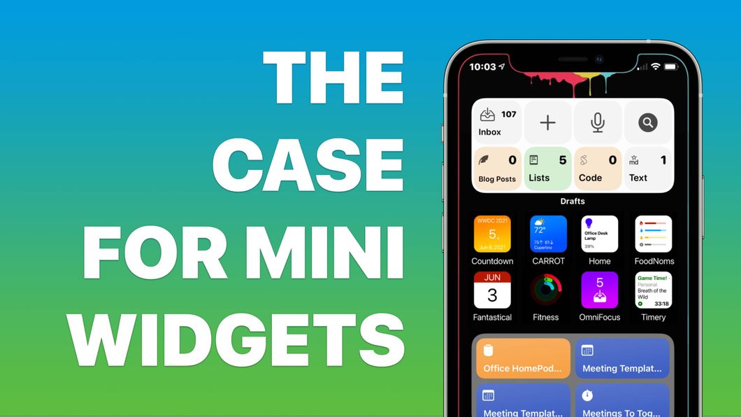
When iOS 14 came out last year, one feature really blew up: Widgets. People were making their home screens not only more usable but “Aesthetic AF”, whatever that means1. Now that it’s been a year and widgets are a thing, I propose a new widget style: The Mini.
I’ve been thinking about this for a while, but was inspired to write it up after reading this post on Matt Birchler’s excellent BirchTree site where he’s advocating for smaller widgets.
I agree. There needs to be a smaller “small” widget. But there also needs to be an even smaller “mini” widget. One home screen icon big. But, with more data, more customization, and more functionality.
I’m knocking this out on my lunch break, so please forgive the crudeness of the mockups, but here’s what I’m thinking.
Some examples… I know these are pretty revolutionary, but stick with me here. 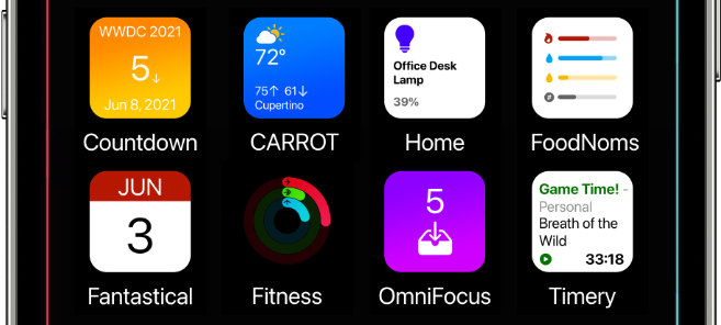
I know none of these are new ideas, and many are done in widgets now. But, widgets now take up SO. MUCH. SPACE. Giving up 4 Home Screen icons to see a timer is bananas. These screens are super high resolution. They can display small things.
WWDC is less than a week away, and I’m looking forward to the prospect of a better Home Screen on my phone, hopefully something like this will be part of it.
I know what it means, don’t email me.↩︎