 |||
|||
I switched the sidebar of the site to a dark color last week. It’s a small change, but I think it sets off the content better than the previous sea of white. Then I noticed something on my phone. The iPhone X series has a notched display, and the background color of the page (by default) fills the overflow area. We need to change that!
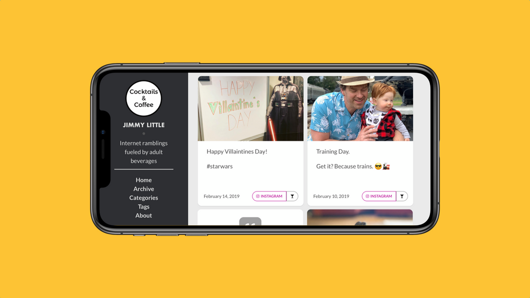
Here is how the site looked pre-this. The dark sidebar with the light stripe in the “safe area” is pretty ugly. And if you hold the phone the other way (notch on the right), the notch cuts off a very small bit of the content cards.
 Before the change. Look at that ugly left side!
So, step one is to add a line of code to the header of your site. I use a Jekyll static site builder, so I added it to the head.htm file that is imported as the header to every page1
Add this to the header of your site’s pages:
<meta name='viewport' content='initial-scale=1, viewport-fit=cover'>This will tell a WebKit browser to scale the content to fit the display instead of staying in the safe areas. Here is what it looks like after that one line is added:
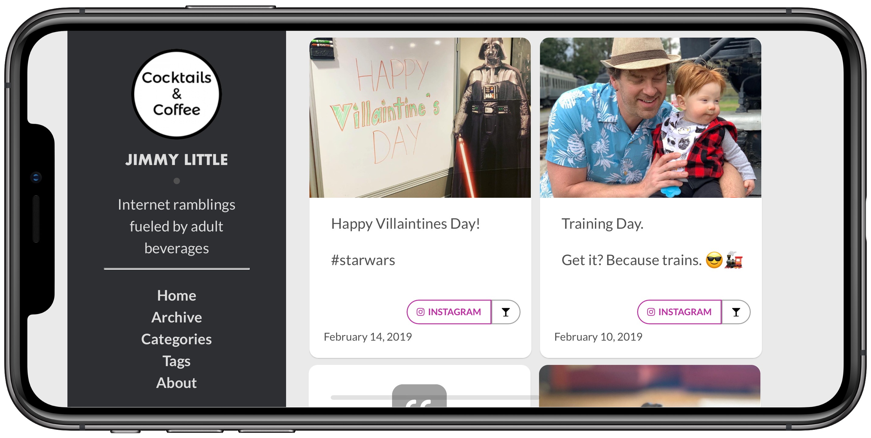
 Better, but now the text is cut off
Much better, but now the text in the sidebar is cut off. We’ll need to add some padding. There are far more complex and elegant ways to deal with this, as laid out in this post from webkit.org. I’m not doing that for a couple reasons. Mainly, the Github version of the Jekyll builder doesn’t support the safe-area-inset variables, so it’s useless to me. Also, in my case, I can fix it with a simple media query so I’m not going through all the additional work.
For my site, the only issue is that some of the text is cut off in the sidebar. Since the sidebar is persistent and never changes, I don’t need any fancy calculations. I just need to nudge the text over.
I have three CSS breakpoints for my site. Basically phone, tablet, and “big”. The iPhone X and X🅂 in landscape both fit into the “big” category, since they have such high resolution screens (over 1440px, which is my “big” breakpoint). So all I have to do is go into the CSS file and add
.sidebar {
    padding-left: 40px;
    padding-right: 40px;
}

.content-box {
    padding-right: 40px;
}
to the media query for “big” screens, and it’s done. What did it do?
.sidebar styles add a 40px padding to the left and right of the sidebar. It’s only really needed on the left, but adding the right padding keeps it centered..content-box style adds a 40px padding to the right side of the content area (basically the light gray background you see). This will take care of anyone who holds the phone with the notch on the right. It’ll keep the content cards from getting cut off.for any screen over 1440px, including desktops and large tablets, but that’s fine with me. There’s enough space for it. If this bothers you, you can play with variables in the Webkit.org link above. It will pull a min/max comparison and present the padding based on device. Again, too complex for my simple use case.
The end result is very satisfying to me. The sidebar color fills to notch overflow area, and the text is all readable.
 There it is!
All of this was done with one line in the header and 6 lines of CSS. Pretty simple.
This is a huge benefit of using @import in your site structure. Each page includes the header file. If you need to change the header, you change it once, and next time the site is generated it’s everywhere. I also do this with the sidebar, the footer, and the related posts modules.↩︎